Growth is a matter of life or death for early stage startups. It’s easy to focus exclusively on top-line growth, such as number of users or amount of revenue, but this is a mistake. Based on this data alone, you won’t know if your growth is robust: Is a massive influx of users hiding weaknesses in your product? If you suddenly turn off marketing, will your business collapse? You need to understand how and why your business is growing in order to plan for the future and to tell your startup’s story to potential investors.
We’ve previously covered growth in the context of how you can use paid marketing to expand your customer base. Now it’s time to focus on the other half of the growth coin: understanding whether those customers stick around. Knowing if your growth is built on a strong foundation is like giving yourself a peek into your company’s future. Cohort analysis can tell you if people love your product and how big your business can be.
Defining cohorts
By tracking specific groups of users, otherwise known as cohorts, you can understand how users engage with your product in the days, weeks and months after you acquire them and, in turn, understand how resilient your growth is.
Whether you segment your user base into daily, weekly or monthly cohorts will depend on what your product does and what behavior you expect of your users. Your goal is to segment cohorts by the smallest duration that gives you meaningful data because that will allow you to iterate as rapidly as possible. Speed of learning should be gated by speed of product iteration, so don’t let your data cycle stand in the way.
For social products like Pact or Wattpad or games made by Toytalk, daily or weekly retention is appropriate. Other habit-forming products like DoorDash or Instacart will operate on a slightly longer cycle of weekly or monthly cohorts.
If you graph monthly active users segmented by cohort, it might look something like this:
MONTHLY ACTIVE USERS
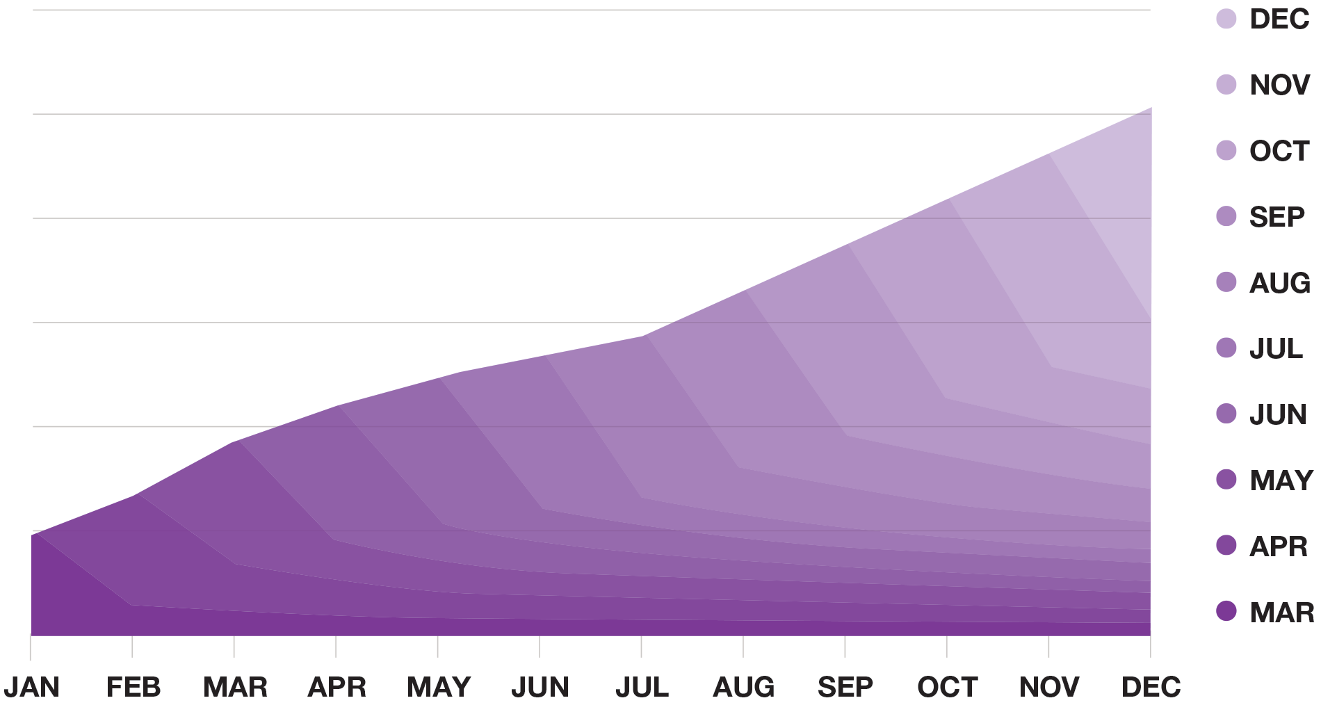
You now have a vague sense of how your cohorts are decaying while your overall user base is growing. The next step is to dig deeper and examine cohort retention.
Analyzing cohorts and retention
Drilling down further, you can isolate each cohort in the chart above and see how many customers continued to use your product in the months after they joined.
Note that the y-axis in the previous monthly active users chart was intentionally obscured because it is irrelevant: whether each grid line represents 1,000 or 100,000 users has no impact on the analysis.
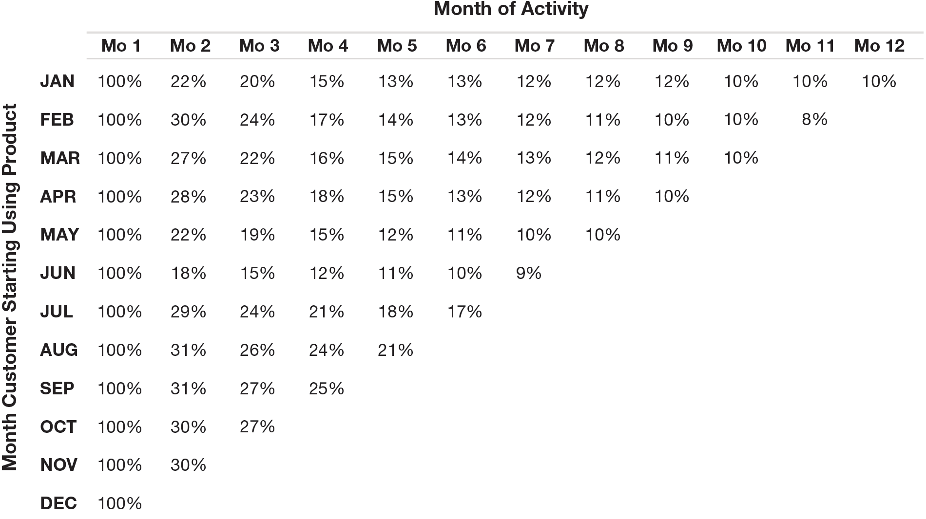
In analyzing cohorts, you should index the number of customers that came back in a given month to the number of customers there were initially in that cohort. The absolute number of customers returning is less important to this analysis than the relative share with the caveat that small numbers in a cohort analysis will result in higher variance.
For example, if you have 5,000 customers in the first month’s cohort and 2,000 of those users came back the second month, your month two retention rate would be calculated as 2,000 ÷ 5,000 = 40%. Take the data from the previous chart and index it to get the following:
It also helps to graph this data:
COHORT RETENTION
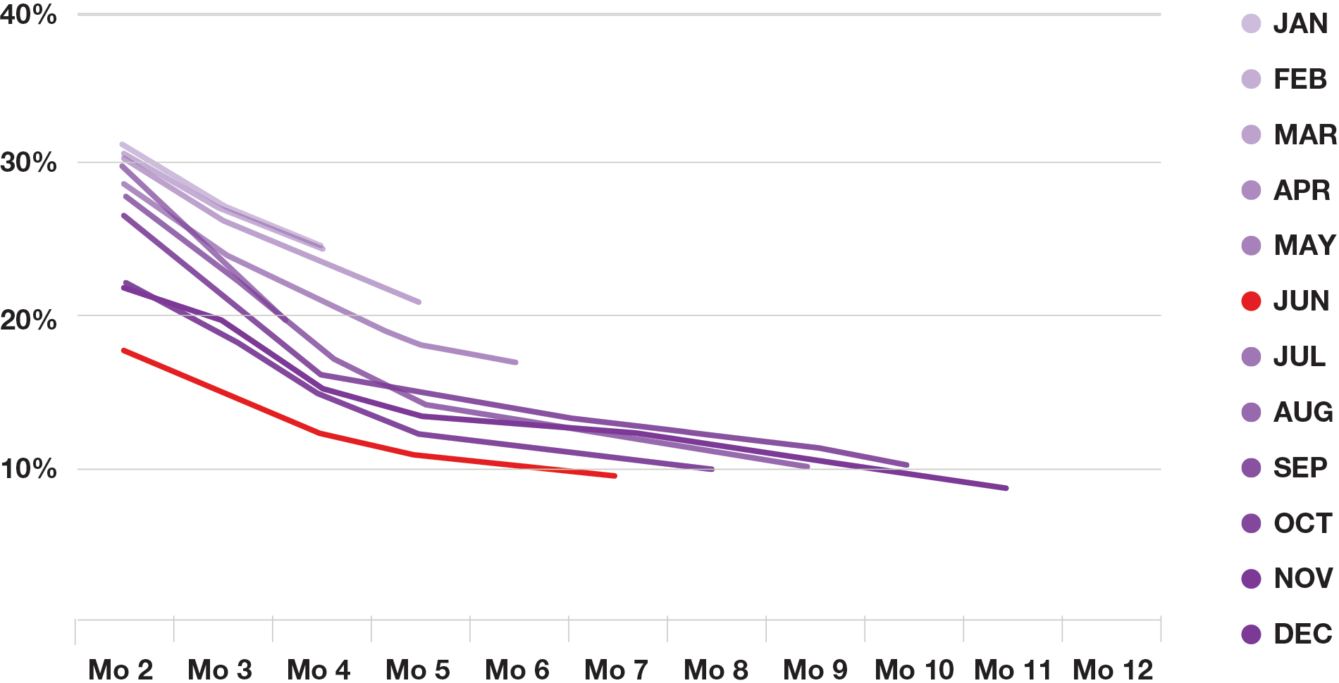
You can see that June (the red line) has particularly bad retention. This product seems to have 12-month retention of approximately 10%. Is that good or bad? The answer depends on a number of factors, some of which are relative, such as competitors’ performance, and some of which are more absolute, like its implications for growth.
As you spend more time with the data, you may uncover additional insights. Let’s look at what happens if we swap the x-axis and the series segmentation:
COHORT RETENTION LEVEL CURVES
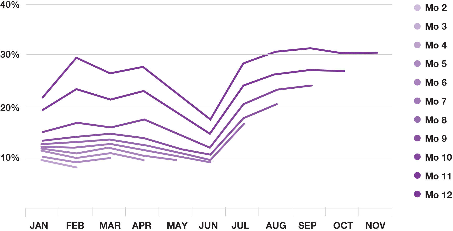
Now you can see how retention is changing over time. Each line represents indexed retention with the top line showing how the second month has evolved and so forth.
It’s clear that despite a dip in June, overall retention has improved in the last 12 months. Whatever changes went into effect in June and July has improved the product’s long-term value to customers resulting in stickier usage.
It’s important to understand how your company’s initiatives correspond to changes in retention. For instance, was the dip in June a result of an outage or a holiday, or was something broken in the product? Is the increase in July due to a new onboarding flow or interface or something else entirely? Linking actions to data helps build a coherent narrative around achieving product-market fit.
In the absence of competitive benchmarks, this starts to paint a positive picture. Your team is making the product more valuable to your customers and that’s empirically demonstrable in the improved retention data. Better retention pays compounding dividends as your company grows.
Why retention matters
Where retention really adds up is when you look at how your customer base builds over time.
The chart below shows the user base for a product where the customer base retains at 80% month-over-month.
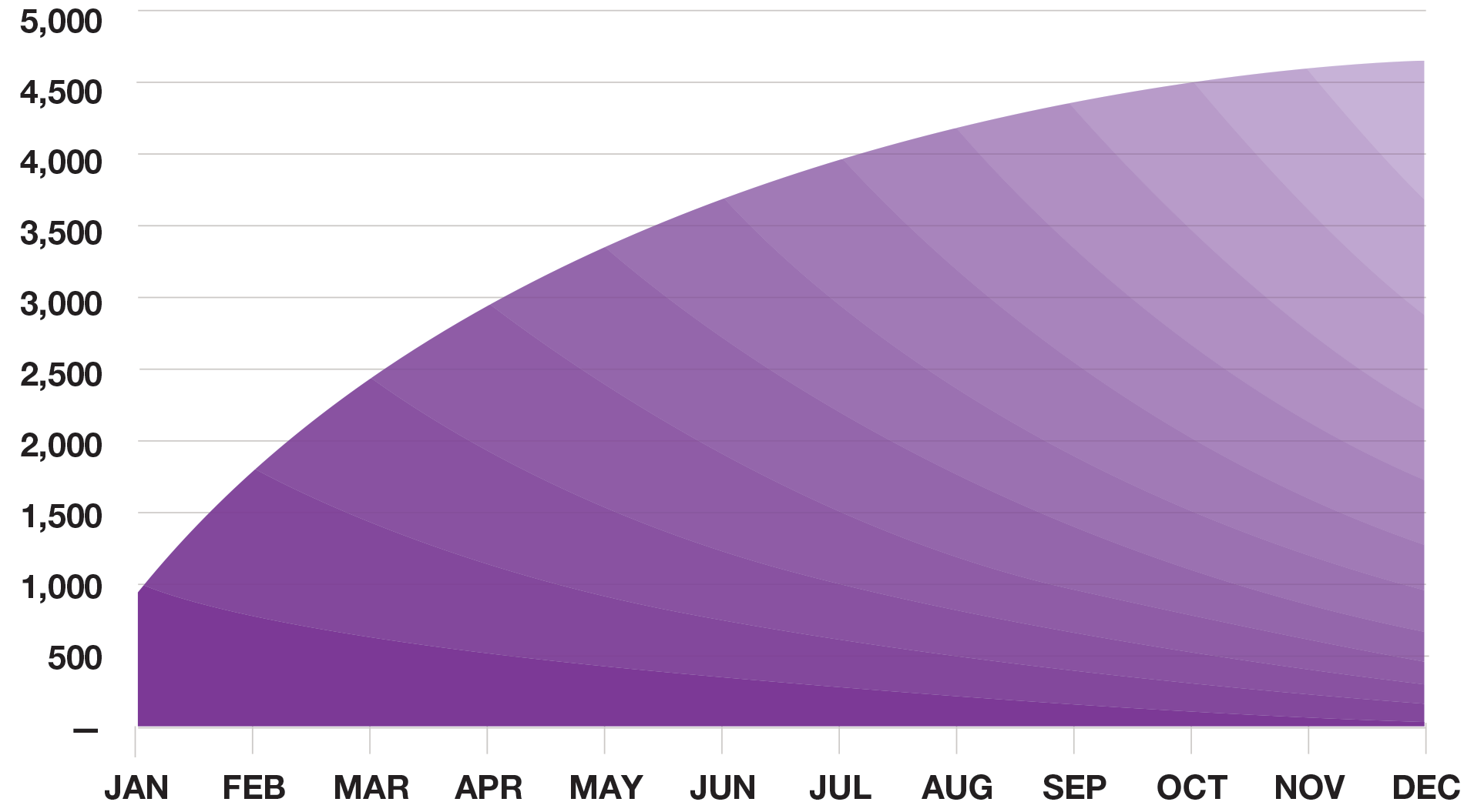
For the sake of simplicity, this example assumes 1,000 new customers start using the product every month. At the end of the first year, only 69 of those initial 1,000 customers are still active.
Even though the product is adding 1,000 customers per month, when cohorts are only retaining at 80% monthly, the overall customer base growth stalls out quite early. In fact, the customer base will stop growing at around 5,000 users because at that point, each month’s attrition is equal to the number of new customers being brought onboard.
It’s hard to scale a business when you’re losing so many of your signups. Even if you sign up a million people, fewer than 70,000 will remain active after one year. It’s difficult and expensive to replace 930,000 people who have stopped using your product.
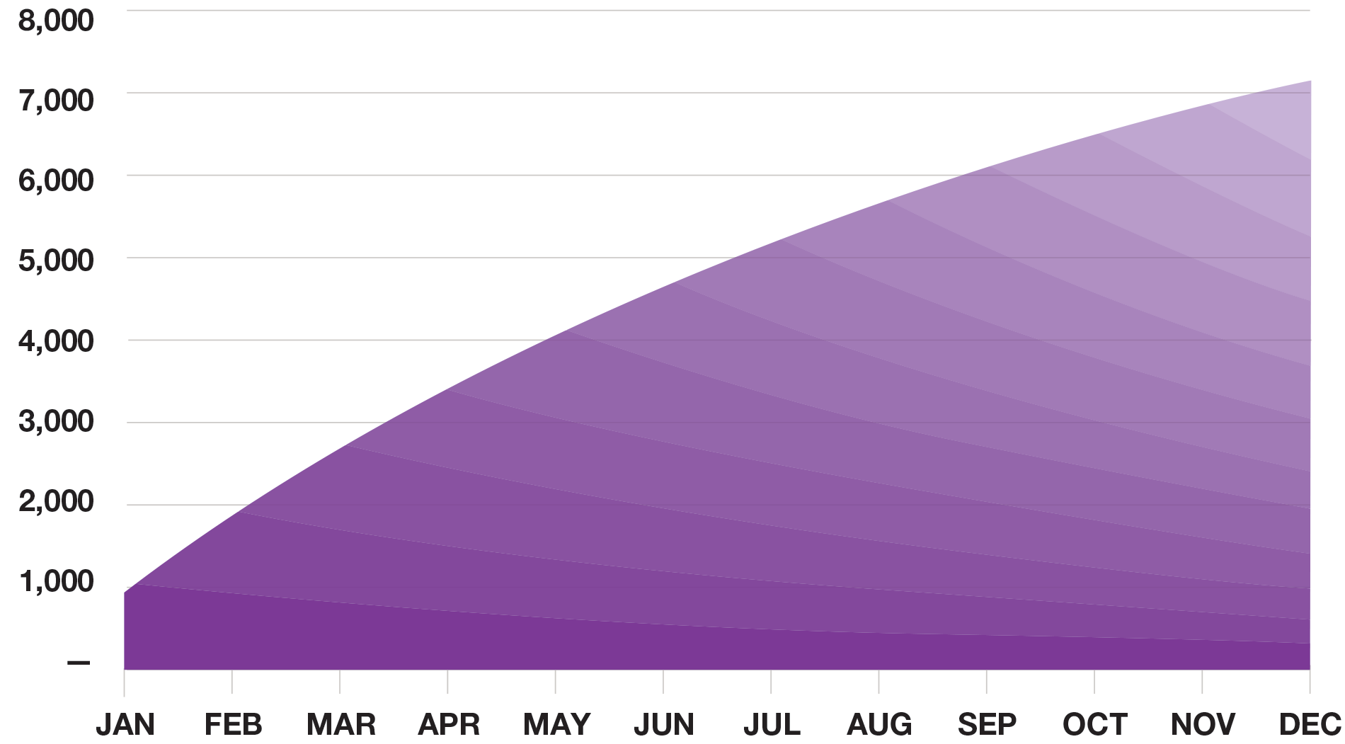
Now, if we cut attrition in half and retain 90% of users monthly, the user base graph looks like this:
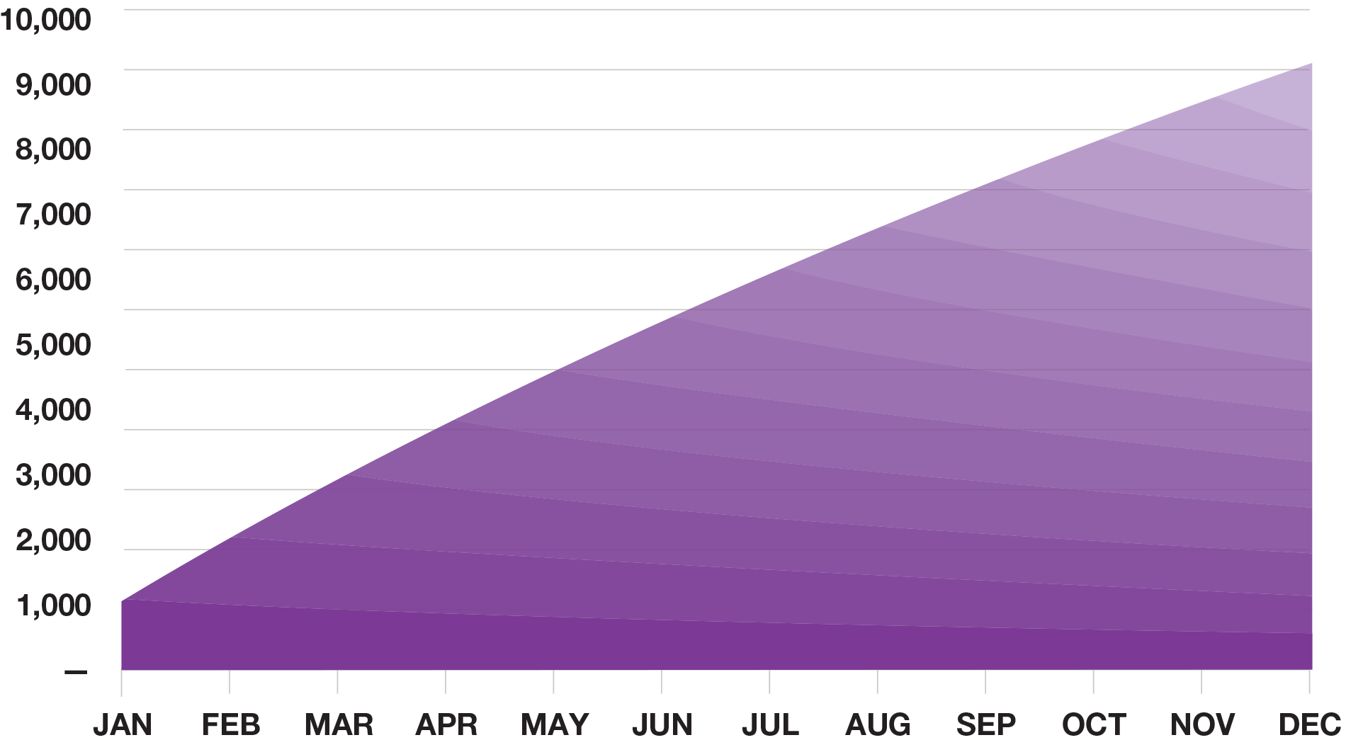
And if we increase monthly retention again to 95%:
Lined up against each other, you can see the impact clearly:
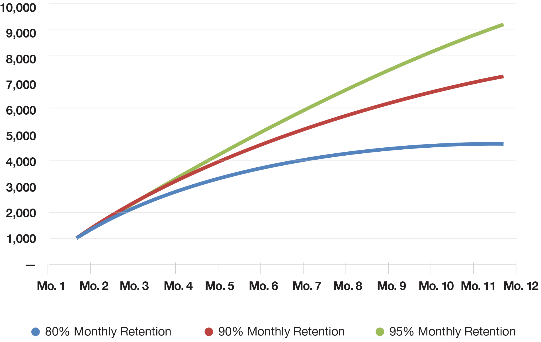
The rate at which you retain users has a significant impact on your growth rate and the overall potential of your business.
Common Mistakes
Defining your cohort
Not all cohort analyses are the same, and some types of businesses will have idiosyncrasies that you should take into account to get meaningful information out of the exercise. Using the wrong cohort frame can hide key insights or lead you to optimize for the wrong outcome.
Using a daily frame on a business that has weekly or monthly cycles will add a lot of noise and won’t help you draw any conclusions. Even monthly cohorts may not be appropriate for certain types of business.
The company Plastiq can illustrate this effect. Plastiq enables entirely new classes of merchants to process credit cards. Some of their merchants, like tax agencies, only take payments periodically throughout the year. As a result, looking at daily payment processing cohorts wouldn’t be a good indicator of how the business was performing or how sticky the product is. Make sure you define cohorts to match the rhythm of your business.
Determining product signup dates
On a more basic level, how you define when someone starts using your product can affect how your cohorts look. If there’s a lag between a customer’s signup date and when they become active, segmenting cohorts by signup date will result in odd effects in the data.
With the payments company, Square, the day a merchant signs up for an account isn’t always the same day they take their first payment. If Square was to cohort its customers by signup date rather than first payment date, they might see more active customers in the week after signup than the week of signup. That’s a customer retention rate above 100%, which doesn’t make much sense. This confounds your understanding of actual product usage by blending people beginning to use the product with people churning from it.
Clearly delineating between the onboarding funnel and retention behavior will bring more meaningful insights out of cohort analysis.
Data informs priorities
Retention analysis is an essential tool in understanding if people love your product and how big your customer base can be, and that’s why it’s a core part of the analysis any entrepreneur should do for their own business. That said, it’s also not the end-all, be-all of a business. In fact, in some cases, low retention can be viewed as an opportunity rather than a perpetual weakness, but the first step is having the data.
It’s impossible to know what you should prioritize if you don’t know where you stand.